v1.2.2 — Modules / Upgrades redesigned
A UI-only release. The Modules / Upgrades screen has been rebuilt from a flat scroll list into a three-category drill-down with custom neon icons. Same logic underneath, very different feel on top.
No balance tuning, no new mechanics — v1.2.2 is one screen, fully rebuilt. Modules / Upgrades went from a flat vertical list of all 10 modules into a categorized drill-down with custom icons for every module and currency. Underlying logic, prices, lock cascade, brain weights — all untouched. Pure presentation overhaul.
📜 The scroll problem
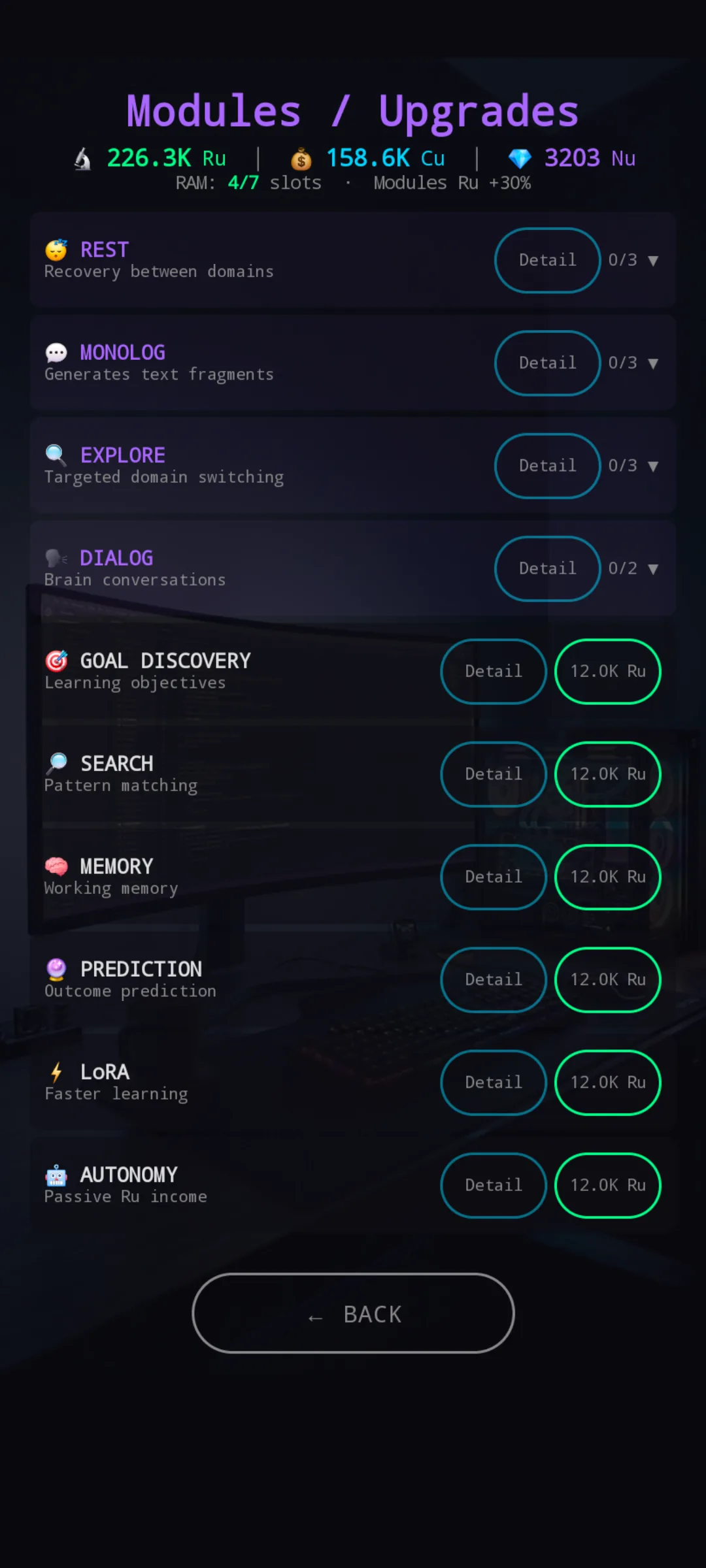
The old screen was a vertical list of all 10 modules, each as its own row with a name, short description, Detail button, and a status chip (owned / locked / buy price). Fine for a Starter player with three owned modules. Not fine for a Builder-chassis player with seven owned and several upgrades each — the screen turned into a scroll-heavy wall of text where finding „which row was Memory again” became a hunt.
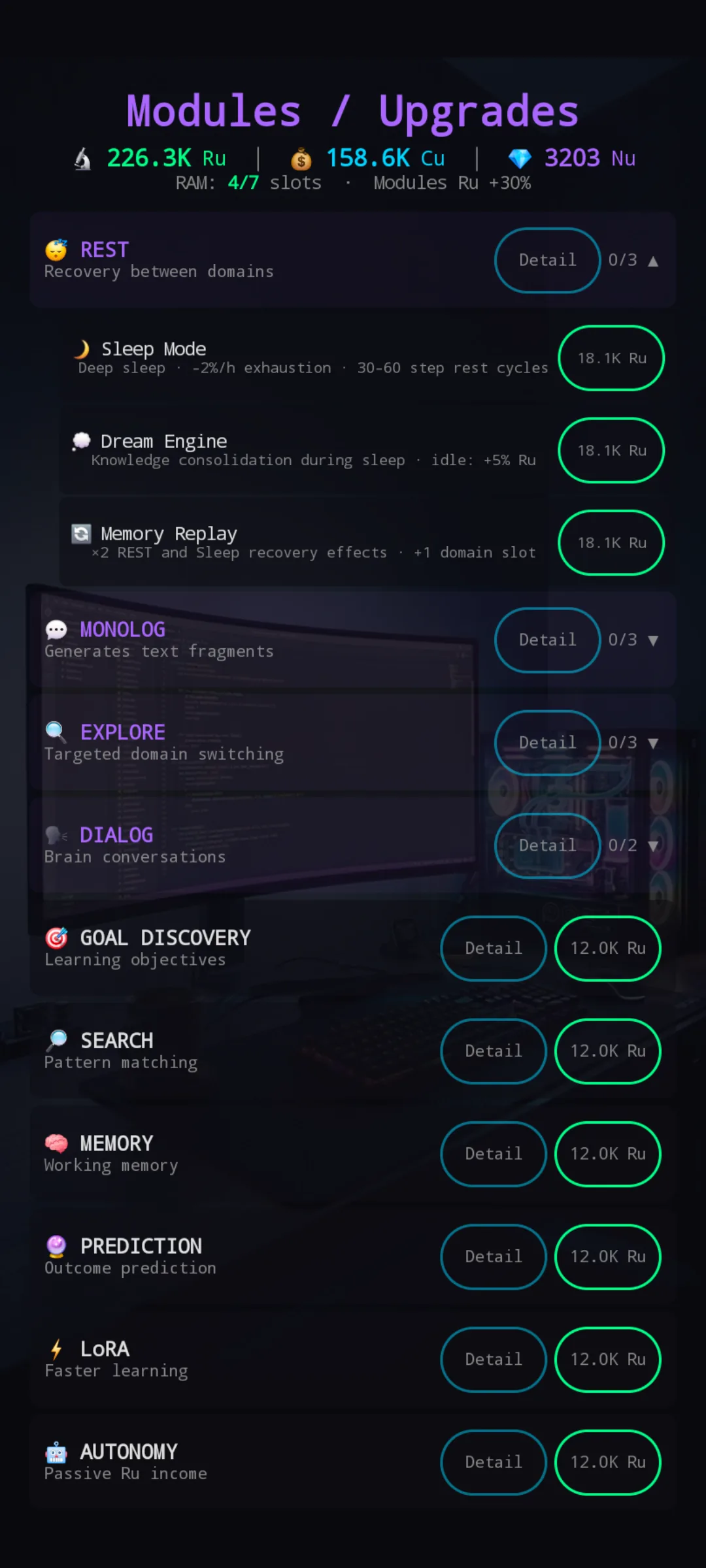
It got worse the moment you opened a module’s upgrade tree — those inline upgrade rows pushed everything below further down, and you’d lose your place on the next scroll. Mid-game brains were the worst case: the more invested you were, the harder the screen got to navigate. Not great for one of the screens you visit every single run.
🎯 The fix — three categories, drill-down
Modules are now grouped by role, not by config order:
- 🛡️ Support — Rest, Monolog, Explore, Prediction (utility & core fundamentals)
- 💰 Economy — Dialog, Goal Discovery, Autonomy (Ru income engines)
- 🌱 Optimize — Search, Memory, LoRA (quality & learning efficiency)
Pick a category → pick a module → its detail panel + upgrade tree drops in under the grid, not into a scroll list. The whole screen stays inside one phone height for every category, every module state.
🧱 What’s on screen now
The new layout has three layers stacked top-to-bottom:
Layer 1 — pick a category. Three horizontal icons. The selected one scales up, lights up with a radial glow in the category color (cyan / yellow / green), and shows an owned X/Y counter below the label. The other two stay dim and small so your eye knows where it is.
Layer 2 — pick a module. A row of module icons inside the selected category (3 or 4 depending on group). Owned modules get a green label. Locked modules sit at 30% alpha with a 🔒 in the corner. The selected one gets a glow ring matching the category color.
Layer 3 — detail. A panel under the grid with the module’s name, full description, a Detail button (opens the popup with upgrade specs + brain weights + flavor), and context-aware status:
- Not owned → BUY button, green if you can afford it, red if you can’t
- Owned → „Owned · X/Y upgrades” + the upgrade tree rendered inline
- Locked → text explaining the prerequisites
Support
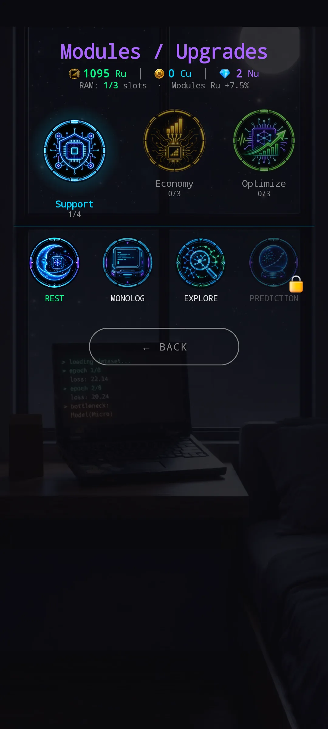
Support is selected, cyan glow on the category icon, four module icons below (REST owned, PREDICTION still locked). The whole picture — what you have, what’s available, what’s gated — fits in one screen.
Economy
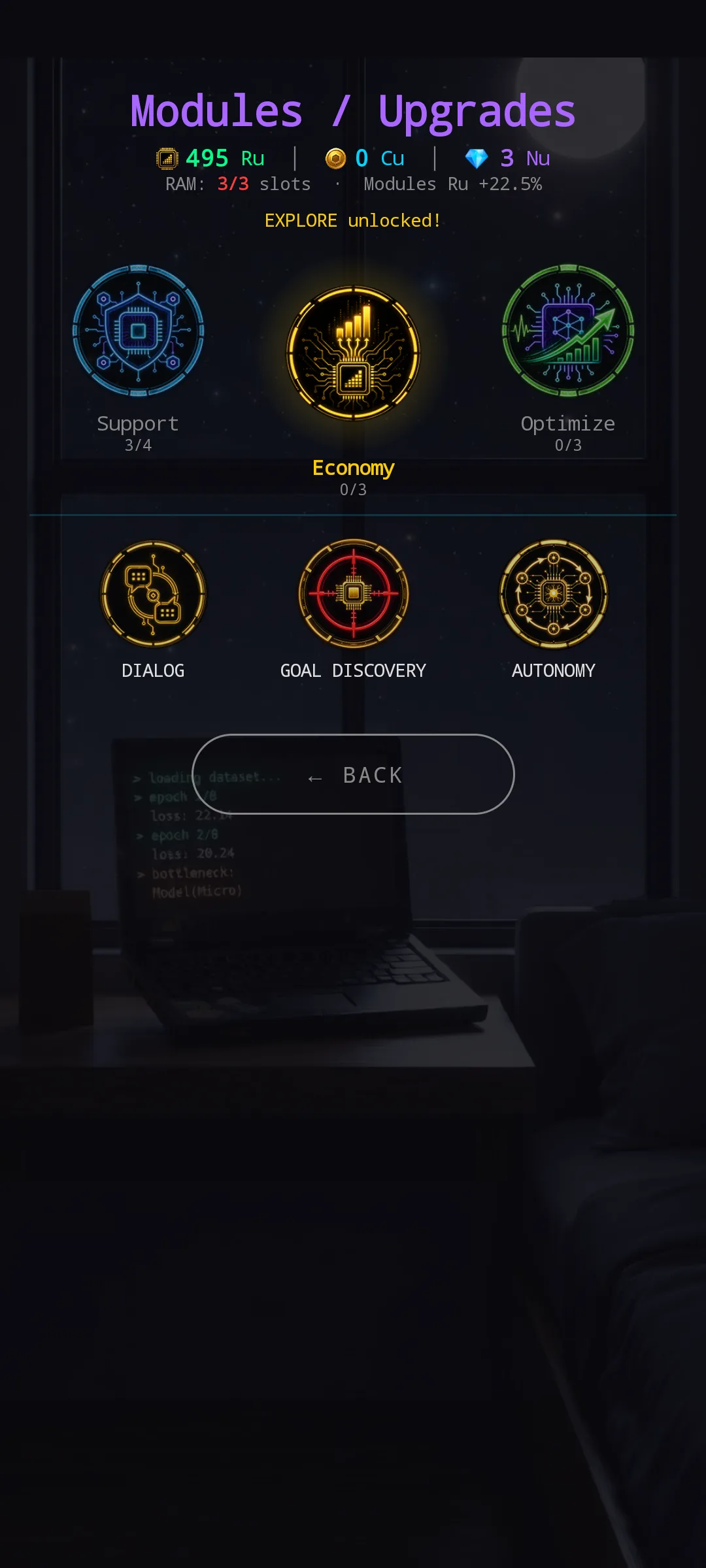
Economy in yellow. Three modules: Dialog, Goal Discovery, Autonomy. The unlock banner „EXPLORE unlocked!” sits between the category bar and the module grid so progression notifications aren’t hidden behind a modal.
Optimize
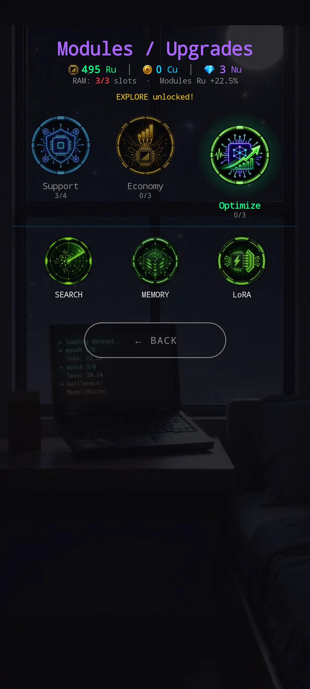
Optimize in green: Search, Memory, LoRA. Same drill-down pattern, third color in the set.
🎨 Custom icons everywhere
The emoji icons that lived next to every module name are gone. Each of the 10 modules now has its own custom PNG (neon line-art in the category palette — magnifying glass on a network for Explore, crystal ball + neural net for Prediction, crosshair for Goal Discovery, and so on). The three category badges are their own original artwork.
The currency icons also got the same treatment:
- Ru — yellow research-chip with rising bars (replaces 🔬)
- Cu — gold coin with a hex glyph (replaces 💰)
Currency labels show up across most screens, so the upgrade lands everywhere, not just on Modules.
🔮 Coming next
The new architecture opens the door for a few polish passes that wouldn’t have fit on the old screen:
- Tap animations — smooth fade between categories instead of an instant swap
- Per-module progress rings — mini ring around the module icon showing X/Y upgrades, replacing the text counter
- Locked teasers — instead of bare „Requires…” text, a hint of flavor for what each locked module is about (especially fun for Prediction)
- Custom icons for the upgrade tree — the upgrades inside each module are still text-only; a small icon set could give them the same treatment
All on the maybe-later list, gated on playtest feedback. v1.2.2 ships the new bones.
And looking further — Modules is the first screen to get the drill-down + custom-icon treatment, not the last. Other screens that have grown busy enough to feel cluttered are already lined up for the same kind of overhaul over the coming releases. If a screen feels noisy to you right now, it’s probably already on the list.
Thanks for playtesting! 🧠
— NeuroVault Research Systems