v1.4.0 — Control Room Update
The biggest visual overhaul since launch. The HUB has been rebuilt from a list of menu buttons into a proper command center with per-tile preview panels. The Brain screen rides along with the same grammar. Brain Lab retires and reappears as Telemetry. Plus a holographic brain projection that changes shape with your Model Potential tier.
This is the biggest visual overhaul since launch. The HUB — the screen you open more often than any other in NeuronIdle — has been rebuilt from a vertical list of menu buttons into a proper command center with per-tile preview panels. The Brain screen rides along with the same grammar. Brain Lab retires, its contents redistributed by purpose. And the model status card now carries a holographic brain projection that visibly changes shape with your Model Potential tier.
Your lab finally looks like a lab.
📜 The old HUB — a list of links
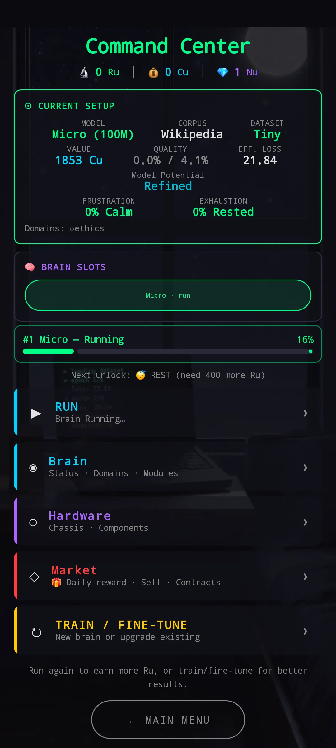
The old HUB had the right ingredients in the wrong shape. A single Current Setup card on top — model, corpus, dataset, value, quality, frustration, exhaustion, all stacked into one block — then the Brain Slots bar and the Running progress strip, both already pulling their weight. The problem was underneath: a flat vertical list of five buttons (RUN / Brain / Hardware / Market / TRAIN / FINE-TUNE), each one a labelled link. Tap to enter, find out what’s there, tap back.
Every section was one blind tap away. The buttons had colour stripes that hinted at each destination’s identity, but a stripe couldn’t tell you whether it was worth opening Hardware right now, or what was sitting in Market this minute. The HUB was a directory — useful, but inert.
Same structural problem we already broke in Pretrain Configuration, Hardware Config, and the Knowledge Domains screen: one surface trying to be a reference for every option and a focused workspace for one option at the same time. Doing both at once does neither well.
🖥️ The new HUB — Command Center
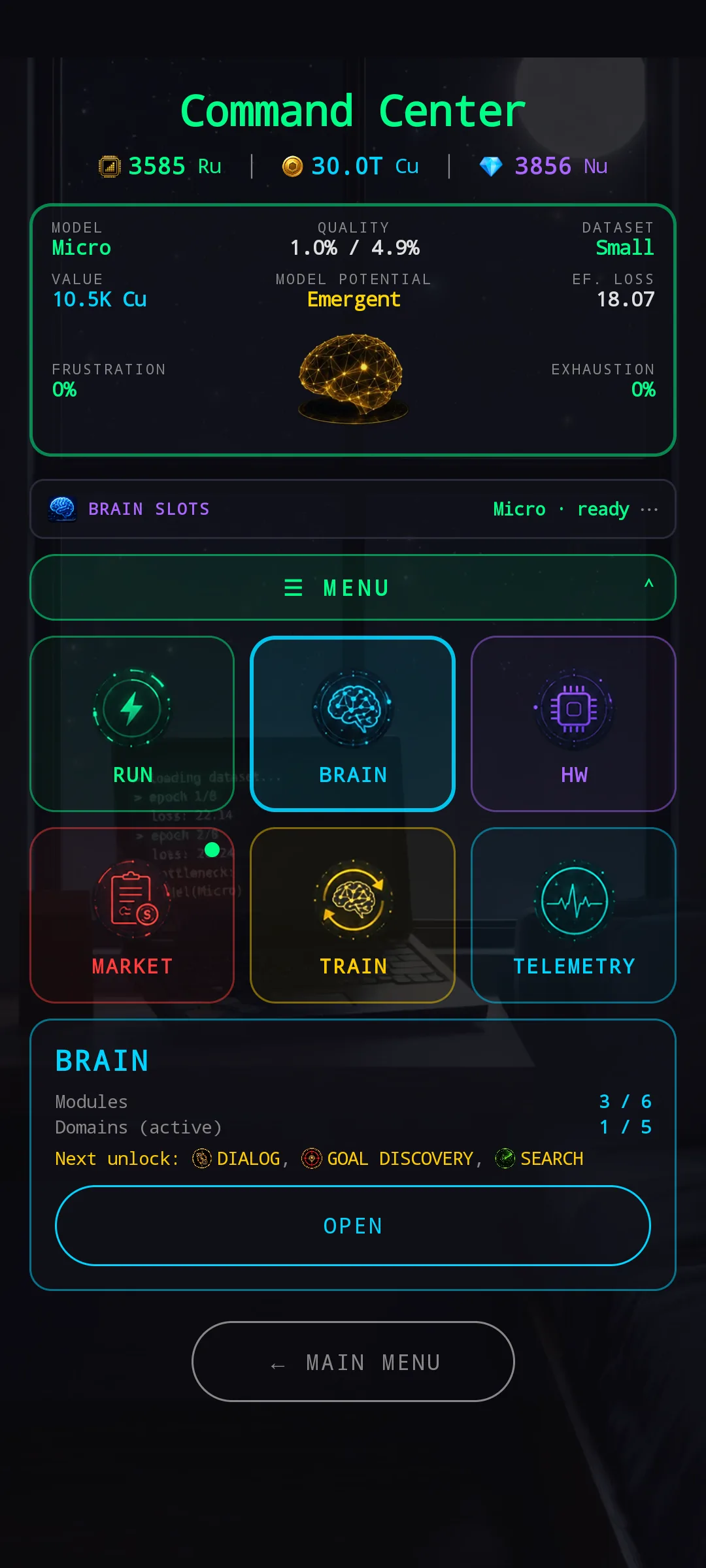
The new HUB is a Command Center. The top of the screen is a compact, persistent brain status card — model, quality, value, frustration, exhaustion, and a small holographic brain projection that changes look with your Model Potential tier. Underneath, a BRAIN SLOTS bar lets you switch between brains right from the HUB, with locked slots hinting at what bigger hardware will unlock. A live activity strip then shows what’s currently training, running, or fine-tuning — always visible, on every screen.
Below that sits a 2×3 grid of menu chips, each in its own colour:
- 🟢 RUN (green)
- 🔵 BRAIN (cyan)
- 🟣 HW (purple)
- 🔴 MARKET (red)
- 🟡 TRAIN (yellow)
- 🟦 TELEMETRY (cyan)
The colours aren’t decoration. Each chip’s colour matches the destination screen’s identity — HW purple carries through to the Hardware Config chassis screens, MARKET red to the Black Market and Contract Board, and so on. The whole game now speaks one visual language.
🎯 Tap once for a preview, tap again to enter
The big idea: a single tap on any chip no longer enters that section. Instead, a contextual preview panel slides in underneath the grid, showing exactly what’s waiting on the other side. A second tap on the same chip enters. Experienced players keep their muscle memory (double-tap to fly through) while new players get to look before they leap.
Each chip surfaces something different — the thing you’d most want to know before deciding whether to go in:
🟢 RUN
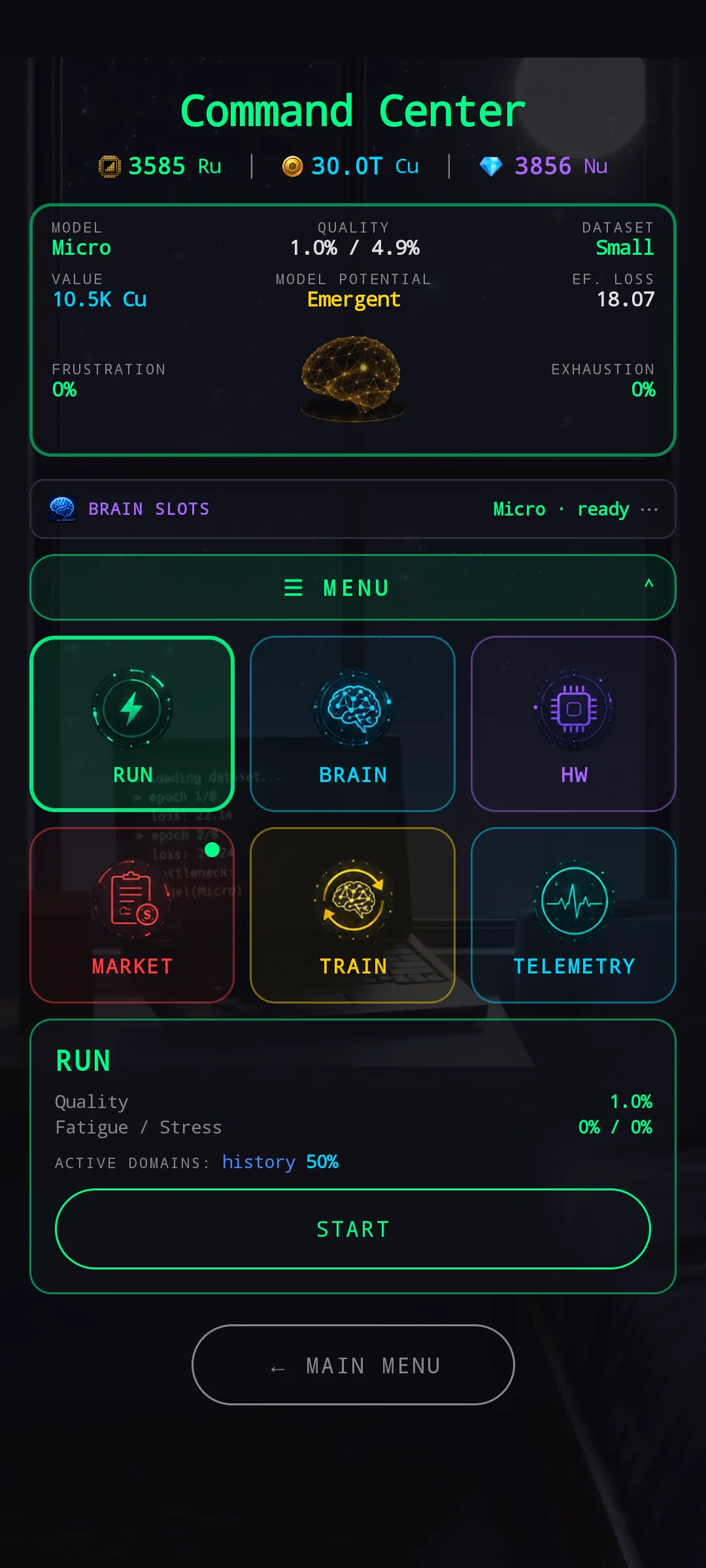
The RUN preview shows your brain’s current quality, its fatigue and stress, the active domain it’s about to learn from, and a START button — so you can kick off a run without diving into Run Config when the setup is already what you want.
🔵 BRAIN
The BRAIN preview shows your module slots used and free, your active domains used and free, and a Next unlock chip strip listing what’s queued behind your current research budget. That last bit is a small win on its own — you can read the gating preview without opening the Brain screen, decide whether your next Ru is going to a module or a domain, and act accordingly.
🟣 HW
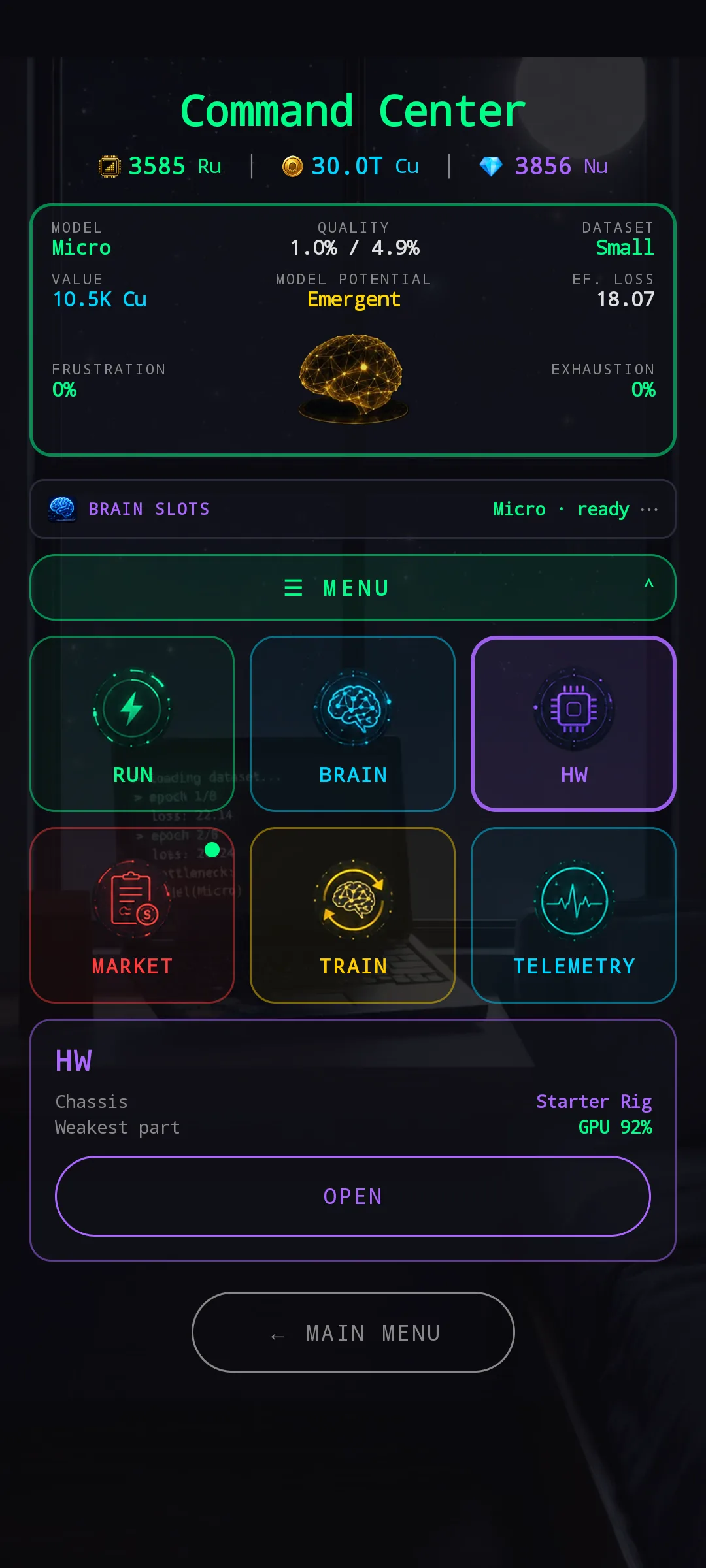
The HW preview shows your current chassis and your weakest component — the one closest to needing repair. No more “I wonder if anything is on fire” mystery before opening Hardware Config. If everything is healthy, you can skip the section entirely.
🔴 MARKET
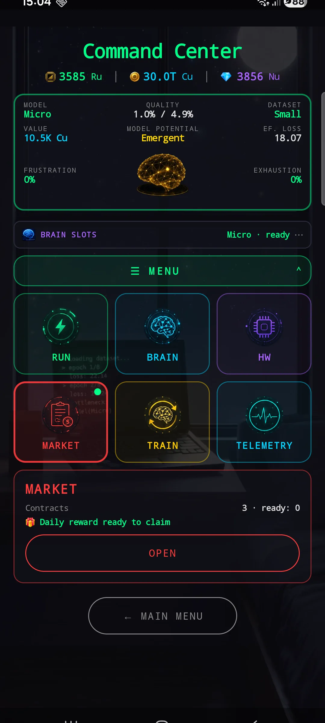
The MARKET preview shows your contract board state — how many are posted and how many your current brain already qualifies for — and surfaces the Daily Reward when it’s ready to claim. A green notification dot appears on the tile itself when there’s something actionable, so you can see “there’s work waiting in Market” at a glance even before tapping.
🟡 TRAIN
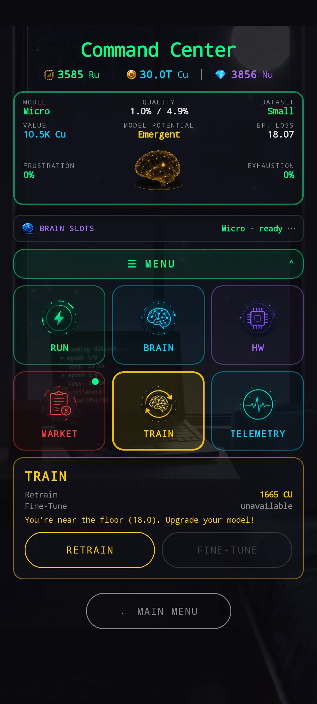
The TRAIN preview shows both Retrain and Fine-Tune as direct action buttons, with availability and cost. Even better, when you’re close to the floor of your current model, the panel tells you so — “You’re near the floor. Upgrade your model!” — so the decision “should I retrain again, or jump to the next model?” gets answered without ever leaving the HUB.
🟦 TELEMETRY
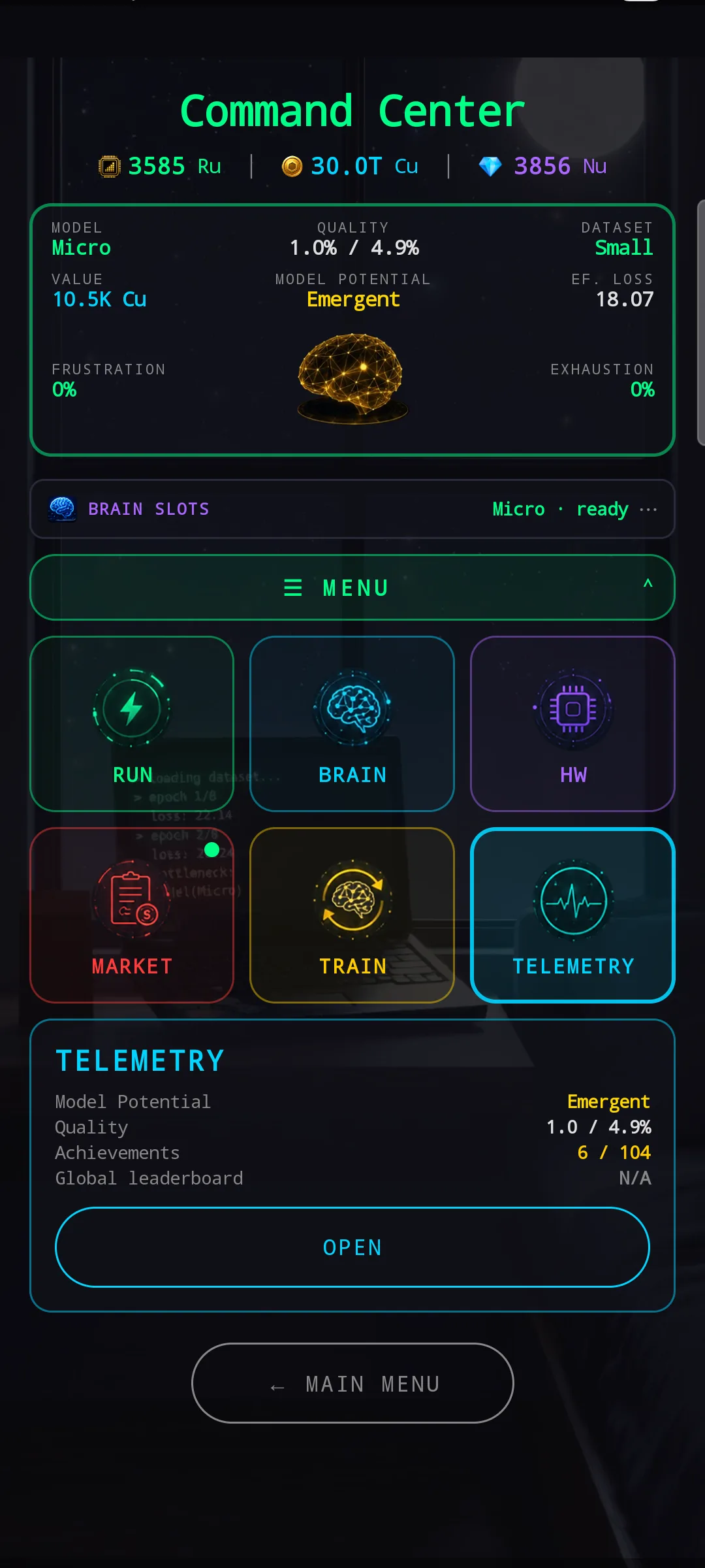
The TELEMETRY preview is your at-a-glance dashboard — current brain’s potential, value, quality, your achievements count, and your global leaderboard placement. (More on Telemetry below — it’s not a brand-new tab as much as a much-needed renaming.)
🌌 The brain projection — a visual reward for Model Potential
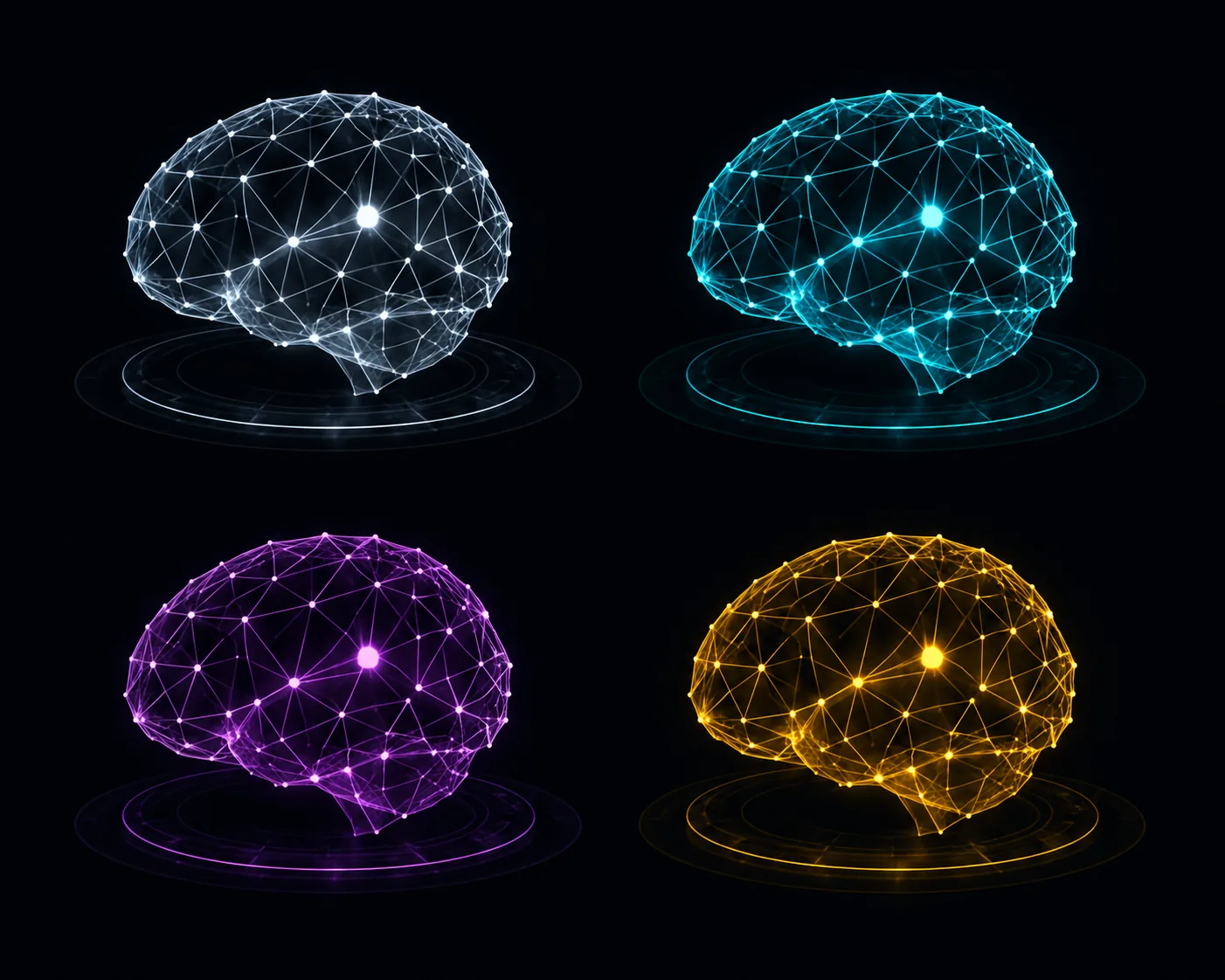
The small brain icon on the HUB status card isn’t a static logo. It’s a live projection that changes look with your brain’s Model Potential tier — silver for Baseline, cyan for Refined, purple for Distilled, gold for Emergent. The visuals warm up as the rarity climbs, and the change happens the moment you train a brain into a higher tier.
It’s the kind of detail that doesn’t change gameplay, but it does change the feel of opening the HUB. You don’t read a label that says “Emergent” — you see your brain glow gold and you know.
🧠 Brain screen — the carry-over redesign
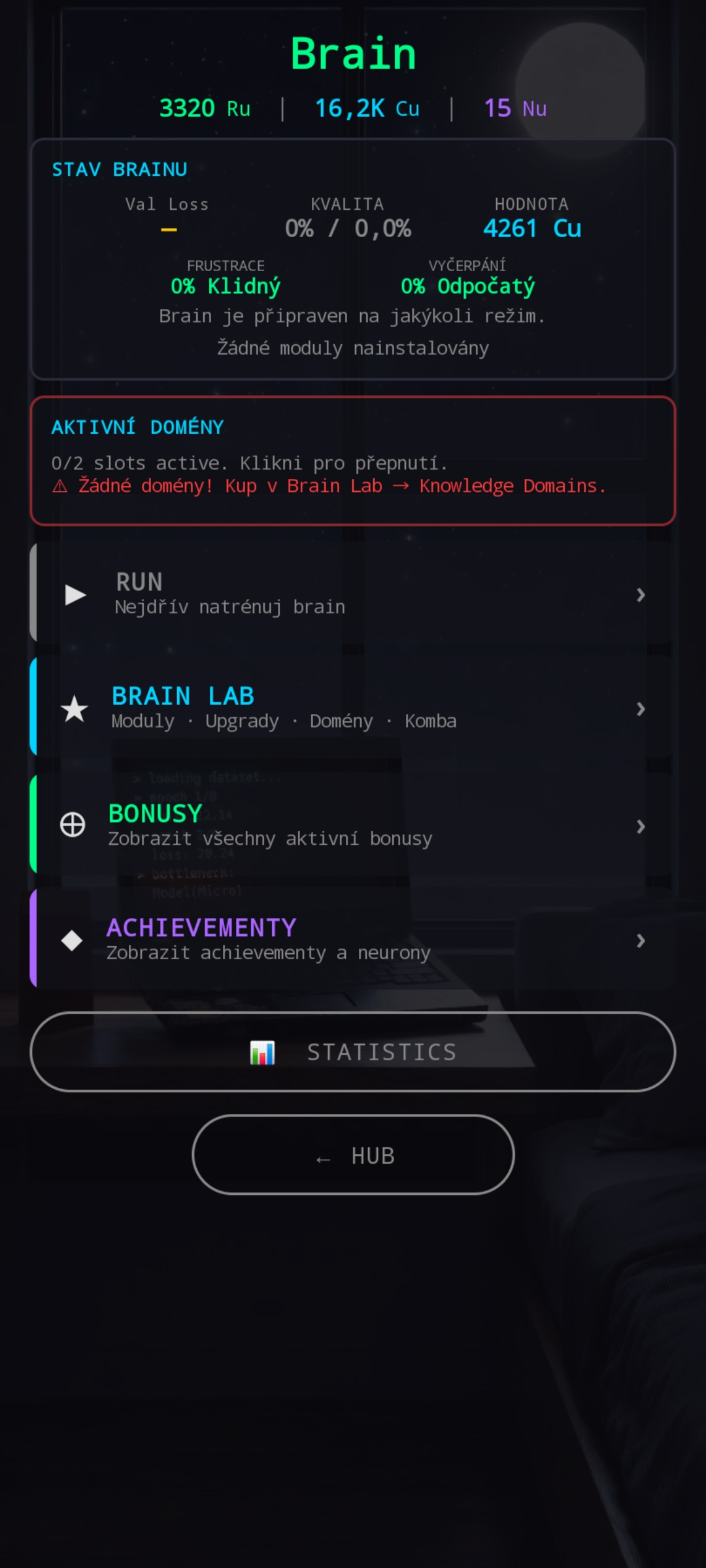
The old Brain screen had the same problem the old HUB had. A stack of status cards on top, then a vertical list of four section buttons (RUN / Brain Lab / Bonuses / Achievements), then a Statistics button pinned awkwardly outside the main flow. Brain Lab was the worst offender — over the months it had become a junk drawer for anything that didn’t fit elsewhere: modules, domain shopping, combos, upgrades, bonus tracking, achievements, statistics. Four different content types nested behind one tab.
We took the HUB grammar and ran it through Brain too — partly so the new HUB doesn’t lead into a visually mismatched screen, and partly because Brain was overdue for the same treatment.
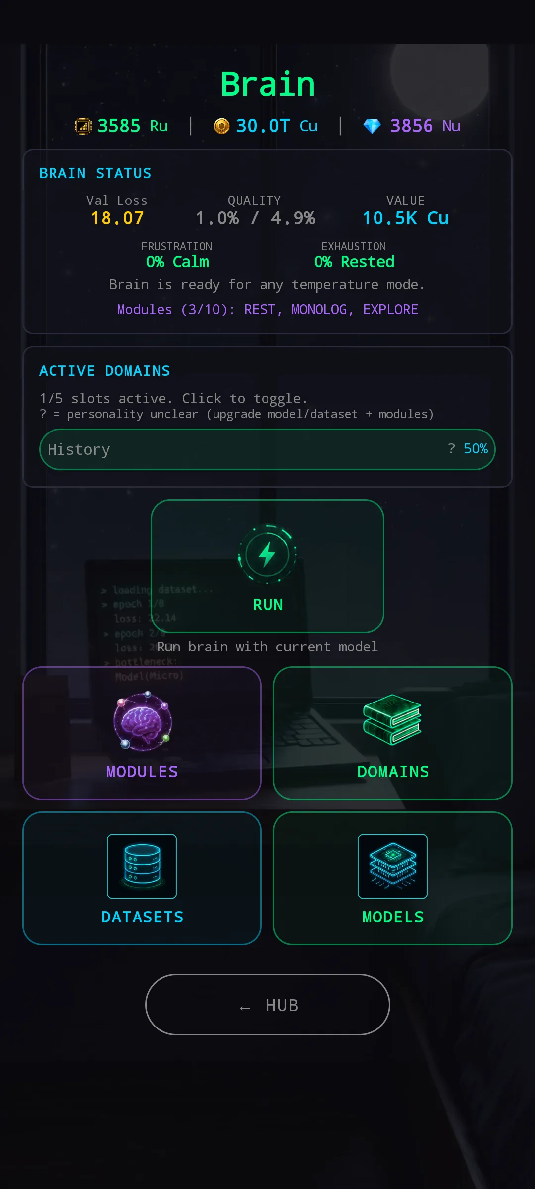
The new Brain screen keeps the status info — Val Loss, quality, value, frustration, exhaustion — but each status now carries a state label alongside the number: 0% Calm, 0% Rested. When the brain is in a clean state, a short hint says “Brain is ready for any temperature mode.” When fatigue or frustration starts climbing, that line changes — it’ll tell you to lean on a balanced temperature instead of pushing extremes. The status card stops being passive readout and starts being active advice.
The four old buttons are gone. In their place sits a 2×2 chip grid: MODULES (purple), DOMAINS (green), DATASETS (blue), MODELS (cyan). Each chip’s colour matches its destination’s own visual identity, and each opens a focused workspace instead of a Brain-Lab-shaped pile.
And the central RUN tile — the big green round chip in the middle? It’s there for two reasons. The first is layout: with five things on screen, four section chips and one action chip, splitting RUN off as a separate hero shape keeps the grid visually balanced and signals at a glance that RUN is an action, not a section. The second is flow: you often buy a module or a domain and want to immediately put the brain to work. Forcing a trip back to the HUB just to hit RUN was friction the screen didn’t need.
📁 Telemetry — Brain Lab, retired and rebranded
If you’ve played NeuronIdle for a while, you’ll notice that Brain Lab is gone. It’s not exactly gone — it’s been broken up and redistributed by purpose.
The Brain-Lab-as-junk-drawer problem was structural. “Lab” implied a place where you tweak the brain, but most of what was actually inside was tracking and meta-progression — bonus lists, statistics, leaderboards, achievements. So we split the pile:
- Configuration content (Modules, Domains, Datasets, Models) moved into the Brain screen where it always belonged.
- Tracking content (Bonuses, Statistics, Personal / Weekly / Global leaderboards, Achievements) moved into a renamed Telemetry tile on the HUB.
The new name Telemetry is also a deliberate pairing with Run Telemetry, the live data stream that watches a brain as it trains. Both are about reading data about your brain — one in real time during a run, the other as accumulated history afterwards. One naming family, one mental model.
🔁 Quality numbers are now the same everywhere
A quieter but important fix: the quality value you read on the HUB status card, on the Brain status card, on the Train Result screen, and on the Telemetry dashboard all come from the same engine math now. Previously a couple of those surfaces took a slightly different path through the calculations, and the numbers could drift by a fraction of a percent. They never disagreed by much, but they did disagree. They don’t anymore.
📦 Under the hood
- 31% smaller download. All art has been converted to WebP with no visible quality loss — a meaningful win on Android storage budgets.
- Stale-run dead-lock fix. A long offline session followed by an immediate re-open could leave a run in a paused-but-not-resumable state. That’s resolved — closing the app overnight and re-opening no longer risks losing the in-progress run.
- Saner auto-config defaults. When you let the game pick stride for you, the chosen value is now more conservative — fewer accidental over-strides for new players, easier to undo for experienced ones.
- Train guardrail. Training can’t start without an explicitly selected model and dataset. Previously the screen would let you punch the start button on an empty slot; now the slot itself blocks it.
- Achievements counter sits in the Telemetry preview so you can see your unlock progress from the HUB without opening the panel.
Hit the new HUB and let it lead. The first time you open it, every chip you tap once will tell you what’s waiting on the other side — and most days you’ll find you only need to enter two or three sections instead of all six.
— NeuroVault Research Systems